Product Design & Strategy
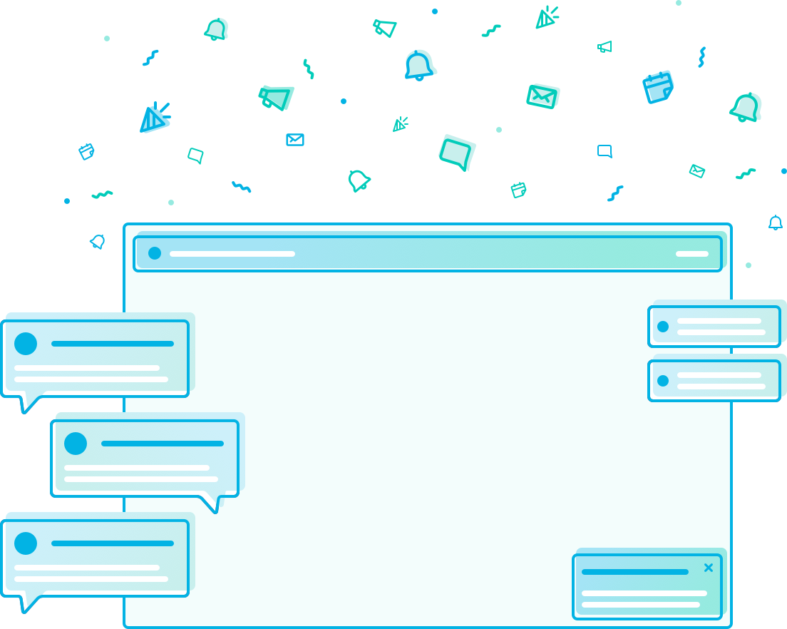
Notification System
Scaling communications to motivate students throughout the online learning experience.
About
Udacity is an online education company focused on upskilling lifelong learners, helping them get closer to their dream job in tech. Their distinct Nanodegree programs offer industry-valued certification in programming, data science, AI, autonomous systems and business fields.
About This Case Study
Notifications are a common feature for most products, but when expanded upon it can grow into its own product area. Where they have their own measurable impact that contribute to user experiences and internal processes. This case study will walk through several deliverables showing how notifications go beyond touchpoint optimization and are designed systemically for impact.
Role
Product Designer:
UX strategy, Wireframing, Visual Design, Interaction Design, Prototyping.
Team
Steve Rogers, User Researcher
1 Product Manager
2 Engineers
2 Data Engineers
Problem Statement
A challenge that most online education companies face are retention and the ability to establish learning habits that contribute to completion. For Udacity, we experienced a number of students who dropped off for several reasons including: conflicting priorities, learner challenges and, misalignment with goals. In parallel, an internally-facing pain point existed within the infrastracure of our interactions with students. Our team, Notifications, focused on both encouraging product engagement through habit-building and operationalizing communication efforts across the company for a more unified and holistic learning experience for users.
How might notifications drive and inspire students to submit a project and be more likely to complete their Nanodegree program?
Design Opportunity
Our User Research team ran several studies to help identify two key pain points for our users, which are milestones that contribute to the success metrics for this design opportunity.
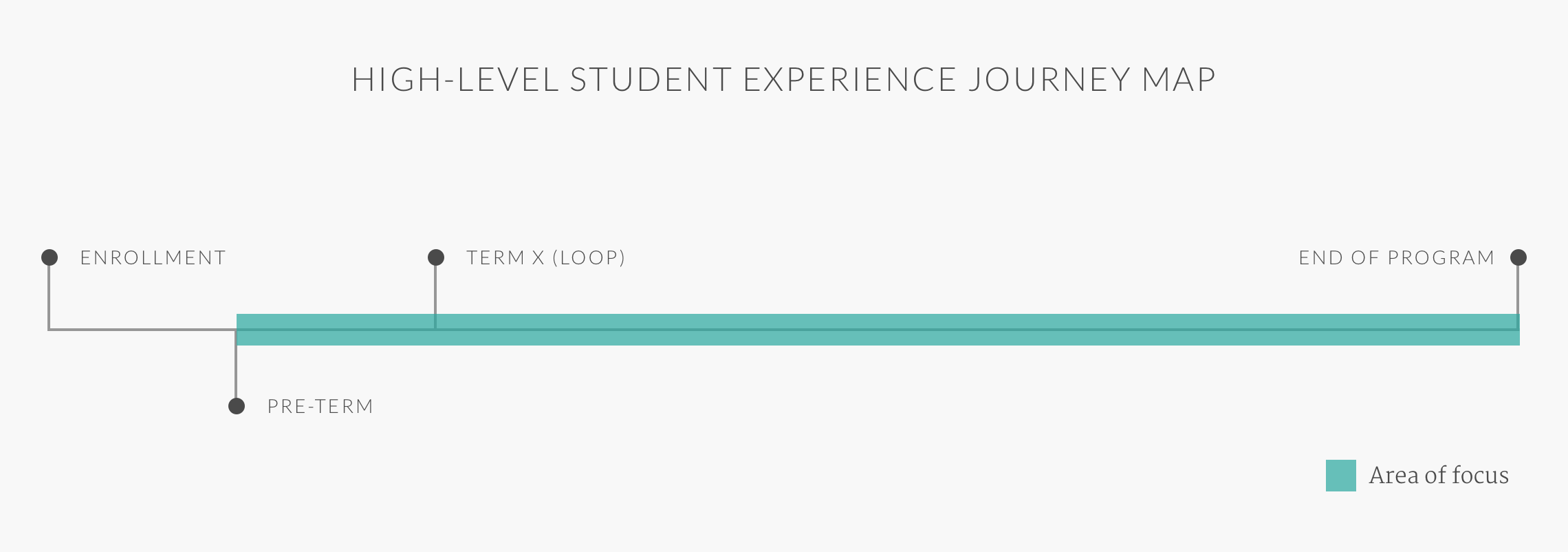
- Pre-term: There’s a significant cancellation during the period after a user pays and before the first day of their program.
- Submission of the first project: Another large dropoff point is during the first project submission, even if they’ve completed all lessons and quizzes leading up to it.
Refining the Scope with Data-driven insights
Our data and research team helped develop a tool that predicts student success and classifies them into groups to assist with user-segmentation. The algorithm helped to identify a correlation within the first 14 days of their learning. This timeframe is hypothesized as the most crucial period in predicting project completion. Students who are more actively participating in their lessons and revisiting the content are more likely to complete their first project. Thus, the more likely they are to complete the Nanodegree program that may help them upskill in their field or get the career they dream of.
Product Area Definition
Notifications as a Product Area
Most communication that occurs between a product/business to a user is characterized as a notification. They are successful at promoting engagement, providing transactional awareness and informing communication. As a product area, notifications must be a presumed medium that can drive the success of a design opportunity. For Udacity, specifically, these are touchpoints with students at particular milestones in their learning journey that helps them complete their program in order to excel in their career or transition to a new one.
What makes notifications successful?
Right message to the right student at the right time and frequency from the right channels.
Process: Hypothesis (Three Approaches)
Notifications Drive Habit
A key to successful learning is to build daily habits that encourage growth. Notifications are a tool that helps and maintains habit forming.
Progress is Key
Small wins are celebratory milestones that help reinforce encouragement. Target: somewhat active students who need a push
System and Autonomy
A notifications preference settings and center helps students with familiary within the product. Building autonomy for Udacity internal team by unifying tools and centralizing data.
Notifications Design Strategy: 1-Year Vision Roadmap
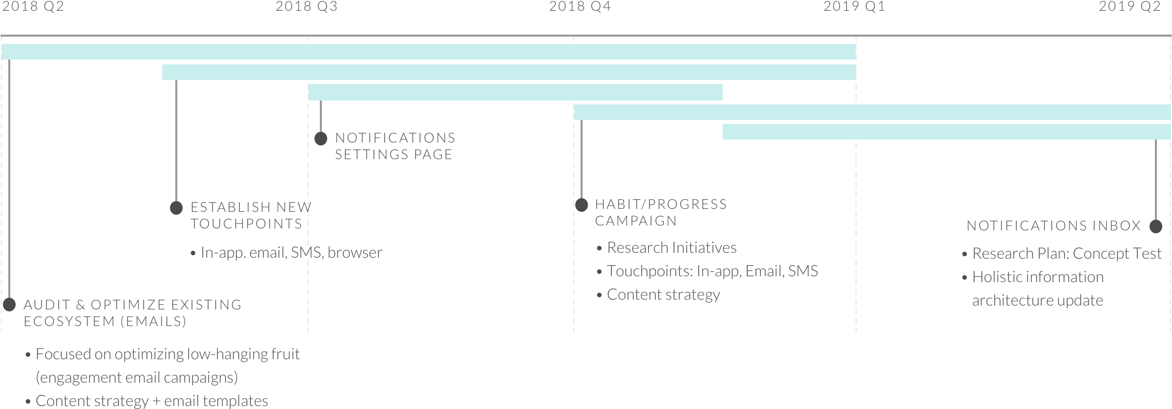
Email Strategy Campaigns
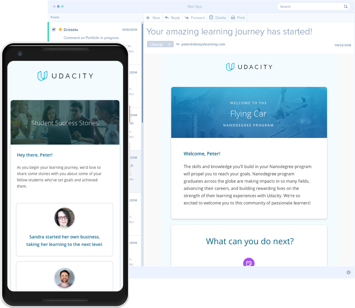
Welcome Email Series
Five emails orienting students to Udacity and their Nanodegree program before their courses begin. These emails helped students prepare for their course, understand Udacity services and maintain their motivation by sharing encouraging student success stories.
 Significant Insights
~80% reduction in cancellations before a program starts
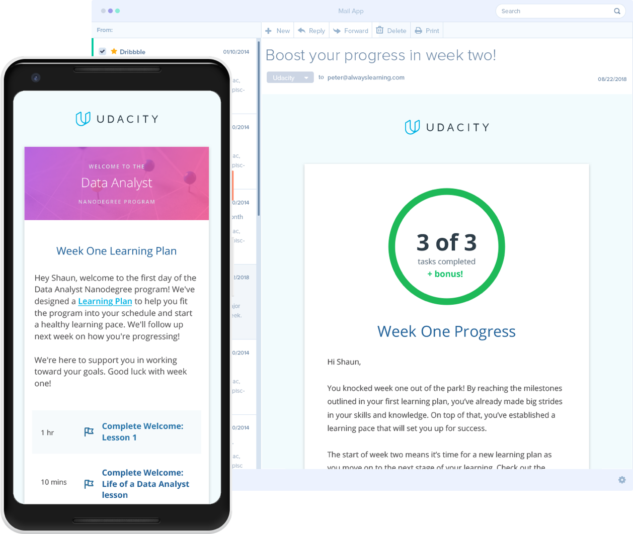
Program-specific Learning Plans
Each program deployed a learning plan for the first two weeks of the Nanodegree to help students build learning habits for the remainder of their journey. At the end of each of the two weeks, a progress email letting the student know how they performed against their goals was sent to encourage them.
Significant Insights
- Highest performing email with an overall ~130% click-to-open rate, meaning some students refer to this email more than once.
~50% increase in classroom visits within the first 14 days
Positive user sentiment toward this campaign recorded in several user interviews and support tickets
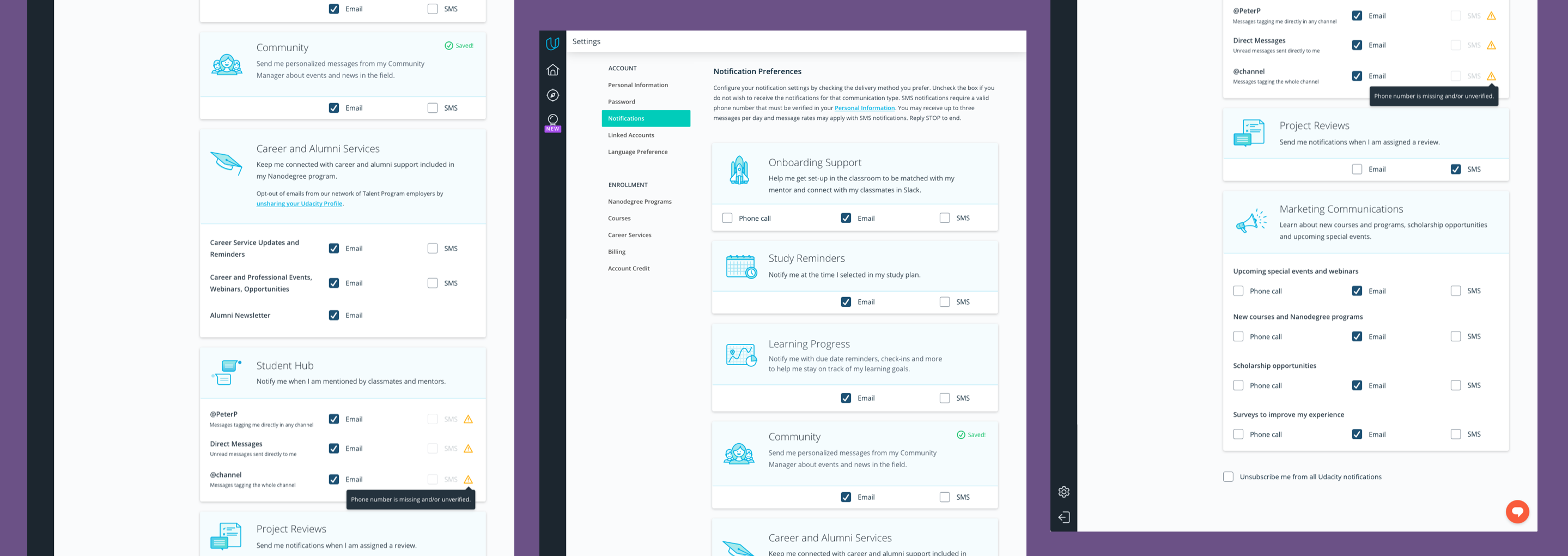
Notification Preference Center
Communication strategy is not a one-size-fits-all solution. Great notifications are personalized and allow users freedom to customize them to fit their needs. Allowing a space for this experience is not often a priority for most products. My assumption is that some, if not most users might be entering this page out of state of friction. They might feel overwhelmed by notifications, annoyed or feeling like they're missing out. So instead of a generic preference center full of checkboxes and copy, I wanted bring in a little dose of delight to brighten up the mood.
That's not all, folks!
Like what you see? This project is still ongoing and some design have no been made live yet. If you're interested in seeing the full case study, please reach out.